There are well over a hundred fonts to choose from when using Microsoft Word. While it's fun to experiment with them, it would take forever to try them all out. That's why I'm picking a handful of the best fonts to use with Word across various use cases, be it academia, design, or even coding.
That includes academic papers, emails, blog posts, professional documents, and just about anything else. There's no sane person out there that is going to get onto you for using Calibri. It's clean and contemporary but still has a bit of personality to it. At worst, it's unassuming, but that also means that no one is going to be bothered by it. You can use Calibri for just about anything, and though it might not be the best option, it'll certainly be good enough.
It might not seem like such a big deal, and to some people, Consolas hardly looks much different from any other generic font. But when you start getting into lines of code or thick paragraphs of complex technical information, every bit of added readability helps, which is why a clearly legible monospaced font like this one is an excellent pick.
That said, Helvetica is extremely versatile thanks to its impressively neutral legibility. It'll fit right in with corporate branding, but also shine in publications or advertisements. Though it might not be the best choice, it can definitely serve for things like academic papers or recreational writing as well.
It's more of a tradition, really. There are plenty of other formal fonts out there to use, but Times New Roman has been the standard for that kind of thing for decades. It'll always look right when you're writing a legal document or a research paper. Sometimes, a classic is massively overhyped, but in just as many cases, a classic holds that title for a good reason, and that's definitely the case with Times New Roman.
That said, some sticklers see serif fonts like this one as being outdated or even overly formal. Times New Roman has its time and place to shine, but be aware of how a serif font impacts your visual tone: even in some professional environments, clients, coworkers, and employers may be put off by overly formal visual presentation. Make sure you know your audience and what they expect from your writing!
These features make Verdana an awesome pick if you're writing an e-book or a publication. Even if your writing ends up on something besides Microsoft Word in the long run, writing it in Verdana will give you a good grasp of what it's going to look like on other platforms you may publish on.
Sending out announcements for a baby shower? Maybe an invitation to an event like a ball or a wedding? Whatever the special occasion is, Fairwater Script can add some celebratory elegance to it. Just remember not to write everything in a cursive script font: it's easy enough to read the big important words, but nobody wants to parse a near-alien written language across several paragraphs.
Ultimately, there are way too many excellent fonts available on Microsoft Word for me to list here. Despite how awesome some of the ones I've talked about are, there are lots of options that can fill their shoes. It's not like Times New Roman is the only formal font, or that nothing can replace Calibri as a standard.
You can even download fonts that aren't already part of Microsoft Word, so experiment with different fonts to find the one you like the most. I'd say there are no bad options, but Wingdings exists, so that'd be a lie. Though even that font could serve as some archaic language for a D&D campaign!
1. Calibri: The All-Around Generalist Font
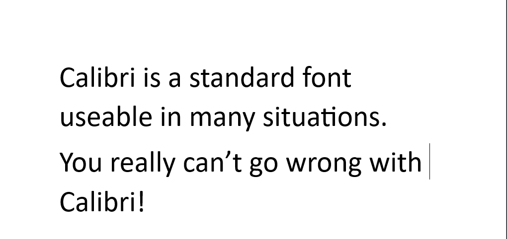
Calibri is pretty much the poster boy for the Microsoft Office suite these days, even though it's not actually the default font anymore. Think of it like the modern-day Times New Roman: it's the standard everyone is used to now, and thus might not seem very interesting, but there's a good reason anything becomes standard, and that's because it works. This sans-serif font, with its rounded edges and modern aesthetic, is appropriate for just about any content.
That includes academic papers, emails, blog posts, professional documents, and just about anything else. There's no sane person out there that is going to get onto you for using Calibri. It's clean and contemporary but still has a bit of personality to it. At worst, it's unassuming, but that also means that no one is going to be bothered by it. You can use Calibri for just about anything, and though it might not be the best option, it'll certainly be good enough.
2. Consolas: The Champion of Technical Documents
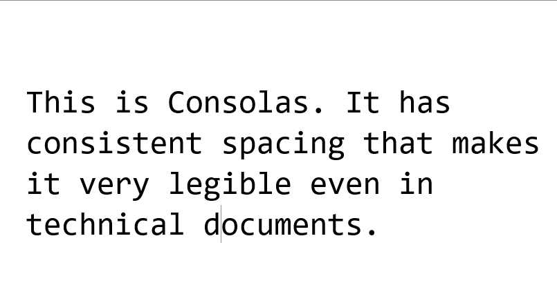
If you need to write up some technical documentation in Microsoft Word, the Consolas font will likely serve you well. This includes coding, technical readouts, data presentation, or any other scenario in which consistent character spacing and no-nonsense legibility are crucial. The monospaced Consolas font fits the bill here.
It might not seem like such a big deal, and to some people, Consolas hardly looks much different from any other generic font. But when you start getting into lines of code or thick paragraphs of complex technical information, every bit of added readability helps, which is why a clearly legible monospaced font like this one is an excellent pick.
3. Helvetica: The Choice for Graphic Designs
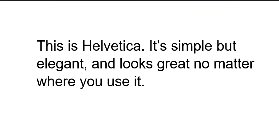
Graphic design is often viewed as a fancy creative field, but when it comes to good typography, minimalist simplicity is often the best. Whether it's designing a brochure, a sales email, or a company slogan, simple function goes a long way, and Helvetica is a font that excels in that regard. It blends elegant old-school vibes with the minimalism of modern text, and remains a favorite of many today.
That said, Helvetica is extremely versatile thanks to its impressively neutral legibility. It'll fit right in with corporate branding, but also shine in publications or advertisements. Though it might not be the best choice, it can definitely serve for things like academic papers or recreational writing as well.
4. Times New Roman: Classic For a Reason
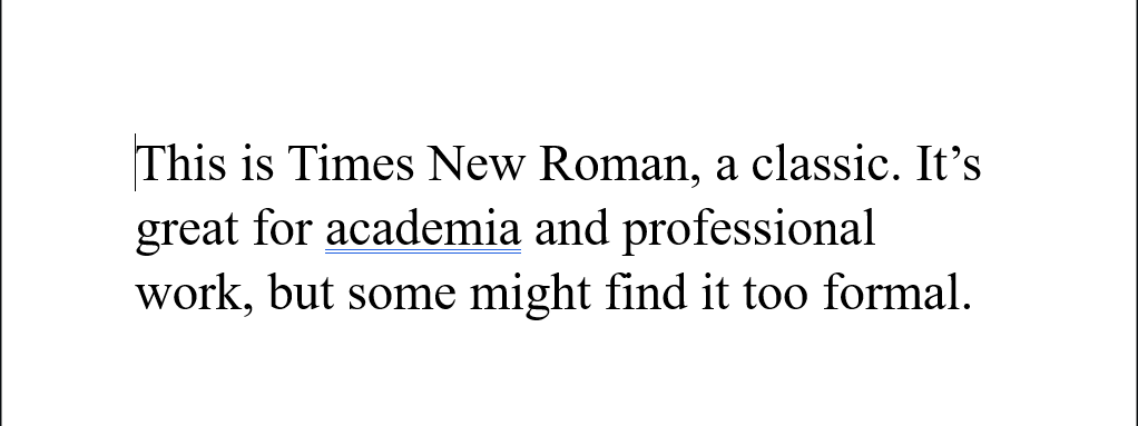
Times New Roman is, in some ways, a relic of the past. If you're old enough, you may remember a time when it was considered the default font for Microsoft Word. Those days are behind us, but that doesn't mean Times New Roman is worthless now. It still reigns as the exemplar font for formality, making it a perfect choice for academic, professional, and business writing.
It's more of a tradition, really. There are plenty of other formal fonts out there to use, but Times New Roman has been the standard for that kind of thing for decades. It'll always look right when you're writing a legal document or a research paper. Sometimes, a classic is massively overhyped, but in just as many cases, a classic holds that title for a good reason, and that's definitely the case with Times New Roman.
That said, some sticklers see serif fonts like this one as being outdated or even overly formal. Times New Roman has its time and place to shine, but be aware of how a serif font impacts your visual tone: even in some professional environments, clients, coworkers, and employers may be put off by overly formal visual presentation. Make sure you know your audience and what they expect from your writing!
5. Verdana: The King of Clarity
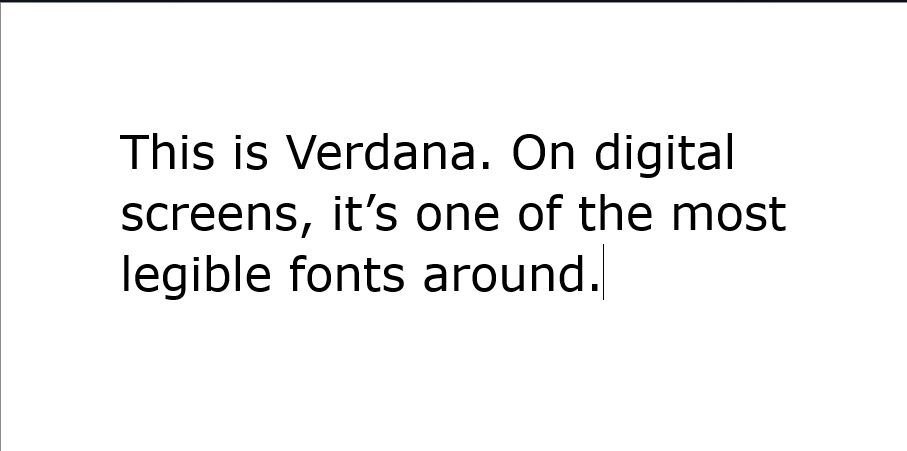
Digital screens are the primary medium through which we all read these days. They come in all shapes and sizes, and some fonts perform better than others when it comes to legibility on any screen of any size. If people are going to be reading your Microsoft Word documents on any sort of digital screen, Verdana is an excellent choice thanks to its strong lettering and ample spacing.
These features make Verdana an awesome pick if you're writing an e-book or a publication. Even if your writing ends up on something besides Microsoft Word in the long run, writing it in Verdana will give you a good grasp of what it's going to look like on other platforms you may publish on.
6. Fairwater Script: For When You Need to Get Fancy
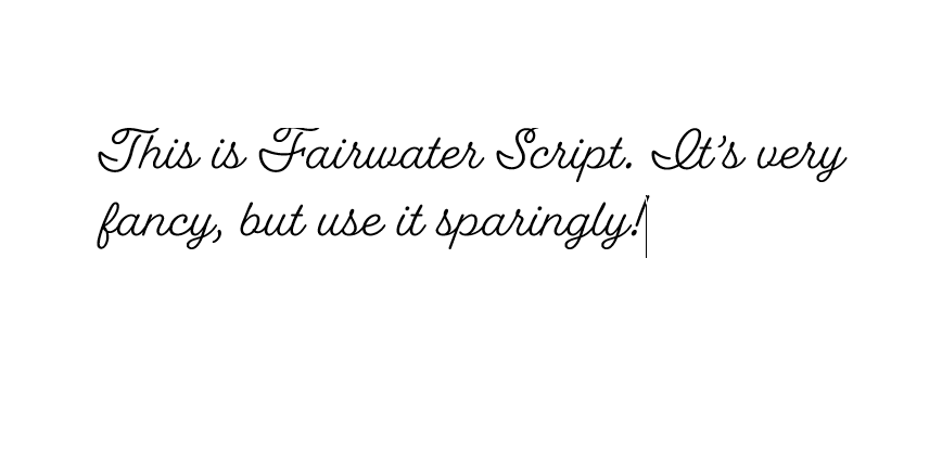
So far, I've mostly talked about fonts that are easy to read in various situations. Well, legibility isn't everything, at least in some niche cases. People don't often write in cursive anymore, digitally or by hand, but there are a few times when a good script font like Fairwater Script can put in a lot of work as one of the better-looking cursive fonts.
Sending out announcements for a baby shower? Maybe an invitation to an event like a ball or a wedding? Whatever the special occasion is, Fairwater Script can add some celebratory elegance to it. Just remember not to write everything in a cursive script font: it's easy enough to read the big important words, but nobody wants to parse a near-alien written language across several paragraphs.
Ultimately, there are way too many excellent fonts available on Microsoft Word for me to list here. Despite how awesome some of the ones I've talked about are, there are lots of options that can fill their shoes. It's not like Times New Roman is the only formal font, or that nothing can replace Calibri as a standard.
You can even download fonts that aren't already part of Microsoft Word, so experiment with different fonts to find the one you like the most. I'd say there are no bad options, but Wingdings exists, so that'd be a lie. Though even that font could serve as some archaic language for a D&D campaign!
